Lista
The List
A smarter, calmer way to manage your grocery list — with less chaos, more clarity
Ux/UI design

Project
Self - initiated UX studie
Date
2025
Location
Malmö
Concept Summary
Lista is a self-initiated UX project designed for people who feel overwhelmed by grocery shopping — juggling notes, forgotten items, or messy group chats. The app focuses on one thing, and doing it well: creating and sharing clean, smart shopping lists.
It’s not a full recipe planner. It’s not another cluttered grocery app. It’s just… your list, reimagined.
01. The Spark
Every time I go grocery shopping, I either forget something or bring home duplicates. I’ve used messy Notes apps, tried to coordinate with housemates via WhatsApp, and even emailed myself lists — and it still felt chaotic.
Then I asked friends, and they all had similar habits:
“I always forget what’s already in the fridge.”
“My partner texts me random things during the shop.”
“We need a better system.”
That’s when I decided to design the grocery list app I actually wanted to use.
02. The Problem
Managing a shopping list sounds simple — but in reality, people struggle with:
-
Forgetting key ingredients
-
Duplicating what they already have
-
Sharing lists with others in real-time
-
Making last-minute changes on the go
-
Keeping it all organized but simple
Most existing tools are either too basic or too bloated.
03. Research & Discovery
I surveyed 25 people and ran interviews with 8 grocery “delegates” (the person who usually does the shopping).
Insights:
– Simplicity was valued over features
– People want real-time syncing with partners/family
– Grouping items by category (e.g. "produce", "dairy") reduces mental load
– Checkbox interactions matter: crossing off feels good!
– Some want optional reminders based on routines (e.g. “Fridays = shop day”)
04. Defining the Vision
How might we design a clean, shareable grocery list that supports real-life routines
— and reduces friction at every step?
Goals:
-
One-tap list creation
-
Smooth sharing and syncing
-
Auto-categorized items
-
Visual calm and order
-
Delightful interactions (small joys in small tasks)
05. Design Strategy
Core UX principles:
-
Input first: Add items fast, even mid-walk
-
Live sync: Any list, shareable with a tap
-
Smart sort: Items auto-organize by store sections
-
Tactile joy: Satisfying animations for checking off items
-
Memory assist: Suggests past items based on your habits
I kept the flow tight:
Home → Tap list → Add items → Done
06. High-Fidelity UI
The visual design emphasizes clarity and calm, with generous white space and soft pastel accents that create a light, focused environment. Thoughtful microinteractions—like gentle slide-and-fade animations when checking off items—bring a sense of flow and ease to everyday tasks.
Smart, recognizable icons (like 🥦 for produce and 🧴 for toiletries) help users scan lists quickly. A prominent floating “+” button ensures users can always add new items in just one tap, no matter where they are in the app. For night owls and parents planning after bedtime, optional dark mode offers a comfortable alternative.
Each shared list includes small avatars (e.g., “You + Sam”) and real-time syncing, so everyone sees changes live—meaning no more double buys or missed items.

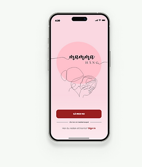
With a clean, welcoming interface introducing the app.

Options screen showing a 60-day free trial with monthly or yearly payment plans.

Smart search field offering autocomplete suggestions while typing product names.
With a clean, welcoming interface introducing the app.
The Outcome
Testers loved the idea and minimalism:
“I want this to replace our family group chat.”
“It’s surprisingly calming to use.”
Lista became a simple but powerful exercise in designing for real life — not productivity perfection.
My Role
I led this project from end to end as a solo UX designer.
Tools: Figma, Miro, Google Forms, Notion
-
Process:
-
Research
-
Synthesis
-
UX Flow
-
Wireframes
-
UI Design
-
Prototyping
-
Feedback
What I Learned
The most used tools are the most invisible ones
Real-time syncing feels magical when done right
Small design choices (like haptic feedback or smart grouping) deeply impact UX
People love tools that get out of the way and support them quietly
Thank you for reading
Designing Listan - was a reminder that even small, everyday problems can inspire meaningful solutions.
If this project resonated with you — whether you're curious about my process, want to collaborate, or just want to talk UX — feel free to reach out.